The first impression a visitor gets of this Burlington condo is surprising. It evokes the timeless grace of a chic European apartment, perhaps one in central Paris or maybe Nice, rather than in an Ontario lakeside city. The quiet sophistication of these rooms speaks to another continent and to a more urban way of life. The result of a collaboration between the owner, who wished to move away from a more traditional décor style, and the well-respected local design firm of Barnard & Speziale, the condo is a perfect living space for those who no longer want to be burdened with a large property but still want to live in elegant style.
The classic simplicity of the entrance hall sets the “feel” of the rooms ““ a Kelly Wearstler burnished gold ceiling fixture and crema marfil marble floor with an emperador marble border feel gently welcoming. A shallow console table anchors the entryway without occupying too much visual space.
The panorama of the main rooms of the condo, as viewed from the entrance hall, is stunning ““ a harmony of creams, beige, and bisques, with a flicker of gray and a flash of gilt. It's serene, calming, but definitely not boring ““ proof that a basically monochromatic décor scheme can be just as compelling as a high chroma palette.
The one thing that the owner stipulated to designer Jan Speziale in the very beginning was her desire that there be no colours in the main rooms ““ off whites and neutrals only. And she wanted a dining room table ““ the first thing you see when you enter the apartment ““ to be a showstopper.
The instructions to avoid colour could have intimidated other designers, but Speziale and her project manager, Erica Sharp, know the power of understated hues. “Creams and off-whites can work dynamically as a backdrop for anything. It makes the dark woods pop, creates high contrast and results in a sophisticated and composed setting,” Speziale explains.
“But because of the simplicity of the colour palette, every detail is crucial. Each piece has to be carefully curated to be the exact right choice ““ in colour, texture, form ““ so that nothing is inharmonious or jarring.”
The condo is situated in downtown Burlington, an urban retreat that remains quiet and private, though right in the centre of things. A short walk takes you to cafes, shopping, the waterfront park and the cultural attractions of the Burlington Art Centre and the Performing ArtS Centre.
The condo space is six years old, with great bones and excellent basics that worked well with the subtle sophistication the client was looking for. Dark stained mahogany flooring, silk drapes in a soft chamois gold and good blinds to block light and preserve privacy were solid design elements that Barnard & Speziale could build on. A wall of windows looks out on the city, providing the interest of an urban environment and enhancing the feeling of space and light.
“I've known Jan for 30 years,” the client tells me. “She knew what I wanted, and it was not difficult to make decisions. If she presented me with three possibilities for an object or a colour, one of them was always the right one.”
For the walls in the main rooms, Speziale chose a changeable paint, Stone House, a warm neutral from Benjamin Moore, what she calls a “mutating colour” that shifts from café au lait to toasted almond according to the light. It's the perfect canvas for the room.
The client requested a spectacular dining room table, and she certainly got it ““ a mahogany topped table that extends to 12-feet, with gilded trim and double gilded wood pedestals. Comfortable chairs ““ the post chairs with fluted backs to add interest ““ are covered in a soft fabric in pale cream, with gold nail-head trim to tie in with the gold accents throughout the room.
“The chairs look elegant and plush, and are very comfortable,” Speziale tells me, “but the fabric has been stain treated, and I could drop red wine on one and it would just pool.”
The carpet under the table is cream wool and banana silk with a subtle tone-on-tone pattern. The buffet is clean-lined and simple, with the added gleam of capiz shell fronts on the doors.
Over the dining table is a solid cast brass, hand rubbed gilded chandelier from Visual Comfort, whose graceful curves show the influence of the French designer Emil Jacques Ruhlmann (1879-1933).
“Many French designs for the 30s and 40s are so classic and simple that they work well with current design aesthetics and aren't at all intrusive,” says Speziale.
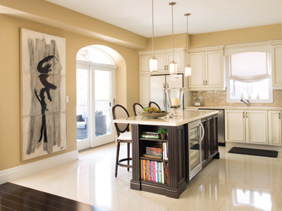
The open design leads easily into the light filled kitchen, with its cream porcelain floor tiles, pale Caesarstone counters and cream cabinetry. Unlike many condo apartment kitchens, this one has ample counter space and plenty of storage room. The barstools around the island are upholstered in a Teflon-coated cream glazed linen. Light from the small patio, with seating for two, floods the kitchen with light and increases the sense of space.
The living room area is defined by another cream silk and wool carpet, a cream linen and cotton blend sectional sofa and two compact lounge chairs. Throw cushions are a checkerboard pattern in animal skin, and a flame stitch in velvet with metallic gold tones.
Instead of a bulky coffee table, Speziale chose three small tables with natural marble tops and gilded metal frames that are light and versatile. They can perform as a central coffee table without being too weighty, or can be moved and used separately.
“We were careful to keep all of the metallic accents in soft gold tones ““ sometimes burnished sometimes polished – and to keep all the wood elements in dark mahogany to match the floors.” That consistency has created a soothing cohesiveness to the rooms, contributing to the sense of stability and calm.
A clever glazed-linen-upholstered table/chair slides under the existing side table, providing extra seating when needed.
In a quiet corner, near the carved stone fireplace is a large cream-toned chair, providing a tranquil space to read a good book. A cream cowhide carpet defines the space.
Throughout the main rooms, artwork adds interest and shimmer. An original work by local artist Gayle Harismowich hangs in the kitchen. Other pieces pick up the grey and beige tones, several of them prints with hand applied gilding or metallic flourishes.
A compact office, painted in Sherwin Williams Dovetail Grey is personalized with framed family photos. The guest bedroom, in Sherwin Williams Argos, another grey, a large master suite and a small powder room make up the rest of the apartment space.
To sit in this cosmopolitan apartment, perhaps sipping a glass of wine on the patio or enjoying a meal in the belle époque dining space, is an exercise in classic good taste and timeless style.