By Kelly Putter
Humdrum might have best described the past vibe of this 2,200-square-foot ranch that sits on five acres of rural property in the quaint and tiny community of Scotland, Ontario.
Built in the early 2000s in the heart of Ontario’s old tobacco belt outside Brantford, the home is situated amidst a pastoral paradise that features a steady parade of farm animals, wildlife and nature in all its tamed and rugged glory. Sadly, the home’s interior did little to honour its picture-postcard setting, so the owners decided the time was right to pitch its builder’s grade feel — dated and dark wooden kitchen cabinetry, poor lighting and sight lines, popcorn ceiling, lacklustre tiles — in favour of a more luxurious and dramatic transitional design that literally raises this roof from blah to bewitching.
“It was builder’s grade… everything,” says Sarah St. Amand, an interior designer who works with clients around the Greater Golden Horseshoe. “We reworked the whole main floor. Actually, it went pretty smoothly and I’m proud to say that the kitchen won an auspicious design award and was featured in the Wall Street Journal.”
A cornerstone of the renovation saw the removal of a 20-foot-long wall that blocked sight lines from the kitchen to the living room. Once the wall was eliminated, the space almost magically opened up and the whole aura of the home shifted from dreary and uninspired to cheerful, spirited and family-friendly. The clients, who are big foodies and home cooks, could enjoy slicing and dicing even more so now that they could keep an eye on their younger children playing in the adjacent great room. The reworking of the interior space meant its residents could make a smoothie and watch Netflix all at the same time. Or they could sip tea while enjoying the serene bucolic view of surrounding pastures dotted with horses, cows and donkeys in the background while the foreground offered onlookers a large, in-ground, kidney-shaped salt water pool complete with gazebo and outdoor fountains.
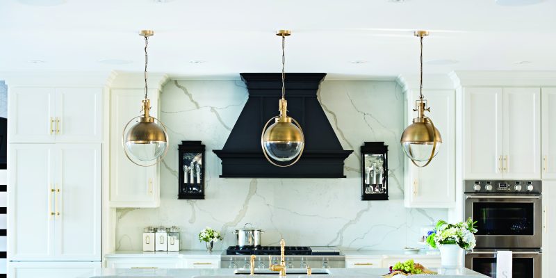
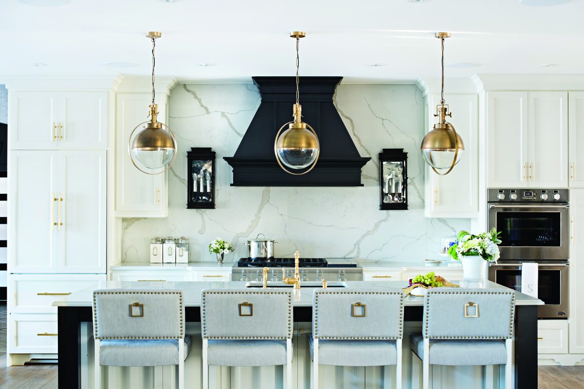
The kitchen is clearly the showpiece of the makeover with the dramatic interplay of black and white and grey in everything from upholstery, countertops, millwork and finishes such as grass-cloth wallpaper. The neutral colour scheme is accented with pops of polished brass in hardware, light fixtures, taps and faucets and “jewelry,” as St. Amand calls it, in such items as the custom-made brushed gold pulls and nail heads on the back of the island’s countertop-height chairs. As with most winning designs, subtlety is the key here. For example, the designer used the same quartz marble on the countertops and the backsplash, creating a statement that manages to infuse drama with quiet elegance.
“Sometimes people make the mistake of glomming onto a colour and completely overdoing it,” says St. Amand. “There are ways of mixing it up. What I like about this monochromatic palette is that it allows you to change the pillows in summer to something fresh and cheery, whereas in winter you might want something more rustic such as wool plaid.”
The clients didn’t want their new kitchen spoiled by the amounts of clutter that are so typically inherent in this space, so St. Amand designed an assortment of hideaway spots. A coffee station consolidates various and sundry hot drink accessories and products, while she maximized space underneath the island for storage. Because the clients have a growing family, careful consideration was given to the potential for mess, so countertop chairs are covered in a faux leather to make clean ups easy. A smartly-appointed adjacent dining room with a collage of cog mirrors that serve to reflect the beauty of the outdoor countryside provide a nice focal point. An extra-wide custom dining table with live edge made by a local Mennonite furniture maker completes the room.
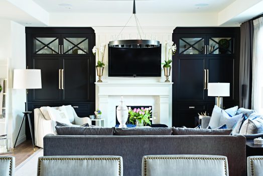
The contrast of black and white is carried throughout the main floor, providing the home with a cohesive and organized space that nicely marries aesthetics with functionality. Black (Benjamin Moore’s Onyx) millwork in both the kitchen and great room provide a striking contrast to the off-white (Benjamin Moore’s Swiss Coffee) millwork of the fireplace and the remaining kitchen cabinetry. The builder’s grade oak fireplace was replaced with a significantly larger customized mantle that included a marble tile surround detail. The larger mantle was designed to provide the owners with more display options.
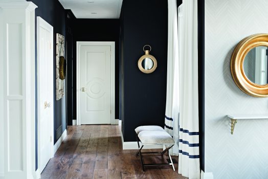
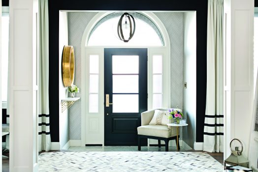
The front foyer is a gorgeous mix of black, white, grey and polished gold. Doors and windows were replaced to add architectural interest and inject the home with a vibe that marries classic design with modern. For privacy and style, the front door was outfitted with an opaque reed glass. But the six-by-eight-foot floor mosaic made of Calacatta Italian marble in a herringbone pattern steals the show, while the wallpaper provides a subtle echo of the floor’s design. Custom linen side panels with black ribbon trim cover the two new windows that flank the front door.
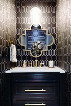
The guest bathroom makes an impressive statement with its all-black walls, ceiling, trim and sliding barn door. The geometric patterned wallpaper adds a contemporary vibe and nicely complements the polished brass faucet and accessories. The collage of round brass mirrors is a unique focal point and contrasts well with the wallpaper’s straight lines.
Sarah St. Amand may be a familiar name to some readers. A regular contributor to Houzz.com as well as Reno & Décor magazine, St. Amand has been designing interiors for 20 years. She was a regular guest on City Line with Marilyn Denis and works for HGTV magazine. Earlier in her career, St. Amand was a lead designer for Benjamin Moore’s corporate headquarters. She completed this project in 2017.