Colour is back in a big way, according to PPG Pittsburgh Paints' colour forecast for home décor in 2011-2012. Homeowners will gravitate toward deep, bold and bright colours to invigorate the greys and beiges of past years. They'll make highly-charged personal choices like lipstick reds and azure blues, setting the stage for a vibrant 2011 and 2012.
“We are rediscovering the joy and beauty and optimism that we need to overcome adversity, and our colour choices for home will reflect that,” says Dee Schlotter, Brand Manager, The Voice of Colour, PPG Pittsburgh Paints.
In addition, two societal trends are at play, says Schlotter. First, design has been democratized. According to Schlotter, the fact that we gather and assimilate information in real-time means that instead of being told by designers what we should like, we discover the look we like and ask designers to help us achieve it. The second trend is the quest for authenticity. It's a reaction to the pervasive and instantaneous knock-offs that come with our real-time world, but it also flows from an embedded environmental sensitivity. That drives us to simplify, to get back to basics, and to live more sustainably.
“It's really important for designers to stay on top of colour trends,” says Schlotter, “Because their clients will demand it. Consumers are much more design-savvy than ever. They notice the aesthetics of their environment ““ from their favourite coffee shop to the airport they pass through to the tissue box they buy.”
Schlotter sees an ongoing design evolution in our homes, pushing towards what's truly personal and incorporating clever new home technologies. “We “decurate,” meaning that rather than starting from scratch, we keep what works and edit out what doesn't to create new looks,” says Schlotter. “Our colour choices are more and more about what makes us feel happy ““ a hit of ruby red behind a piece of art, teal in the kitchen or citrus on a ceiling.”
Schlotter explains that trends are never about one colour in isolation, but about combinations of colours striking new harmonies. Each of PPG's trends is presented in a signature five-colour card that captures the colour trends in furniture and accessories, as well as paint colour. “What woods are being used with those wall colours? What are the new accents being thrown into the mix?” she asks. “Our trend Harmony cards answer those questions as well, to help people achieve the look.”
The four new “Wow Colour Now” palettes in PPG Pittsburgh Paints' The Voice of Colour program for 2011-2012 are:
INstinct
The soul of this trend is warm and authentic. Fusing the raw and primitive with a technical aesthetic, INstinct is a mature style that appeals to a citizen of the world ““ a mix of ethnic exoticism and modern sophistication.
The palette conjures the natural beauty of wood grains set against mineral finishes, the subtle variations of deep brown leather and the varied and deep greys of ancient stone. It is organic and unadorned; the most muted and grounded of the trend palettes.
PPG Pittsburgh Paints colour references include Cracked Slate, Silver Bells, Gypsum, Oregon Trail and Chaparral.
Glamour
With a focus on the “amour,” Glamour is mysterious, sensual, rich and complex. A sense of déjí vu imbues the atmosphere. Glistening metallics and intricate motifs connect this trend with the past. Glamour's take on pattern is bold and sharp, with plays on negative space that surprise and delight. It's audacious and challenging, the look slightly theatrical: Sleeping Beauty with a bite, Paris classic with an edge.
Glamour's black is moody and deep, the red, strong and sexy. Rich neutrals are inspired by materials with a past ““ limestone, bronze, black marble.
PPG Pittsburgh Paints colour references are Dark as Knight, Timber Beam, Angel Food, Almond Cream and Rum Runner.
New Bohemia
With a sense of whimsy and an appreciation of craft, this bucolic trend updates vintage for a new generation. Rooms become personal scrapbooks that integrate quirky secondhand objects with memory pieces. It's gypset, fusing the ease and carefree lifestyle of a gypsy with the sophistication of the jet set. Floral, fairytale and fantastic inspirations mix it up with modern for a look that is untamed and original, still charming, but more adventurous.
Pink nurtures the creative spirit and aqua refreshes. Both are anchored in the palette by craft-paper beige and the warm dark wood tones that play predominantly in hard goods.
PPG Pittsburgh Paints colour references are Red Cedar, Happy Trails, Hat Box Brown, Green Wave, and Aqua Fiesta.
UPcycle
UPcycle appeals to the optimist who values craftsmanship and rejects waste, who values things with a history. It embodies simple living, keeping only what is functional and personal.
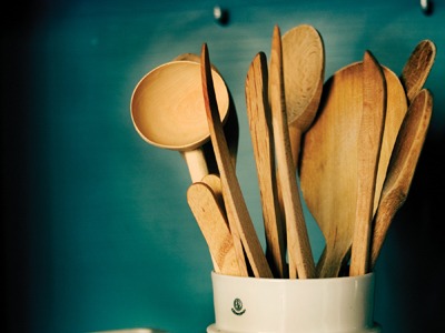
The palette is warm and welcoming, settling on wood tones and the quiet hues of undyed yarns, untreated metals and tone-on-tone ceramics. Bright blue colour blocks inject the dose of “up” into this trend, lighting up pale wood tones.
PPG Pittsburgh Paints colour references are Brown Basket, Allspice, Gold Buff, Chalkware, and Adventure.
“Wow Colour Now” colours can be tinted into any of PPG Pittsburgh Paints' paint lines, including premium zero-VOC PPG Pure Performance and ultra-premium, low-VOC Manor Hall Timeless.
To learn more about PPG Pittsburgh Paints and “Wow Colour Now” colour palettes, and to find the dealer nearest you, please visit the PPG Pittsburgh Paints colour website at www.voiceofcolor.com
